PendL · Summer 2024 · Internship, Geodata
The design was done in week one, then came the users
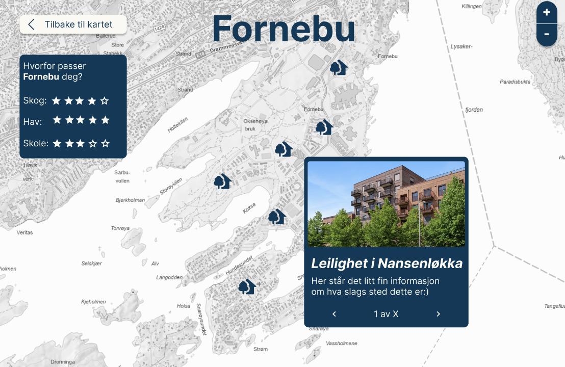
We were asked to design something that served social sustainability. My team’s answer was PendL: enter your workplace, say how long you are willing to commute, and see where around Oslo you could live.
As the team’s designer, I spent the summer interviewing and testing, and rebuilding what those conversations told me to change — the input, filters, map and colors.
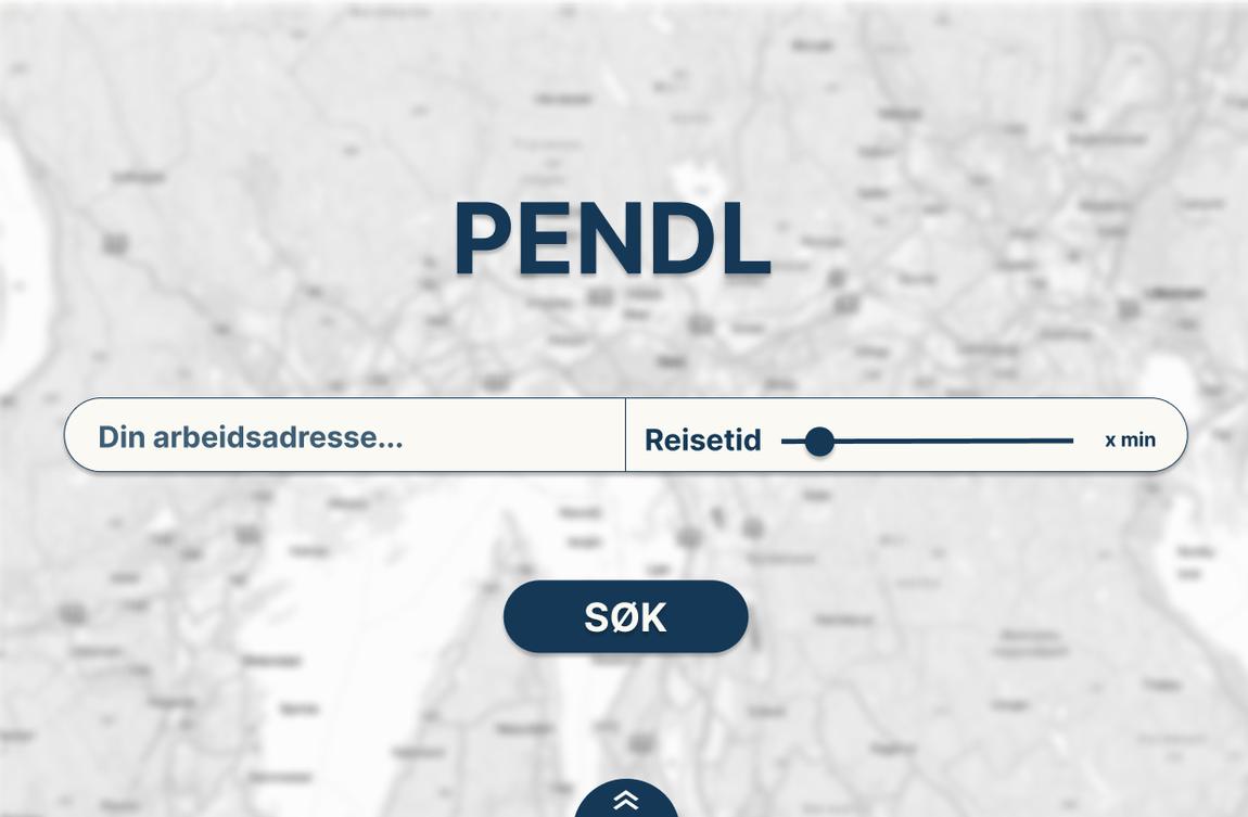
We were the target group
The team itself was the target group — students planning to move back to Oslo, feeling the pressure of getting onto the housing market. This made the first prototyping quick, and after the first week, the team was happy with my designs and the developers ready to build.
Then I ran semi-structured interviews with six people, all friends: students in Oslo and Bergen, and people working in Oslo. I asked about their commuting habits, what mattered the most when choosing where to live, thoughts on functionality — and critiques of my design.
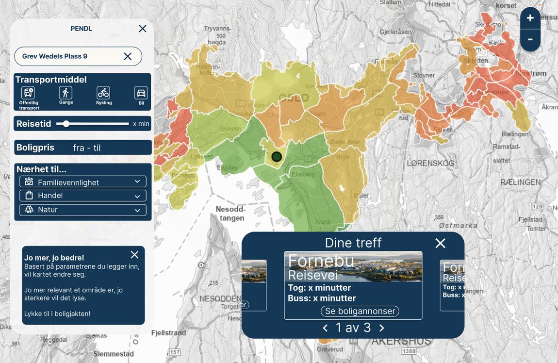
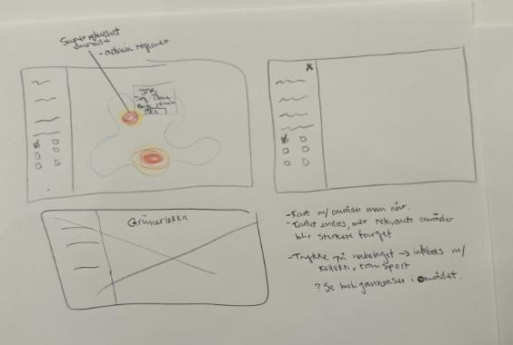
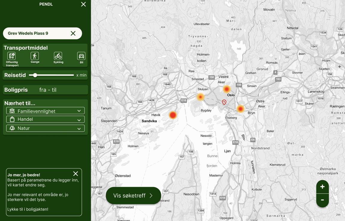
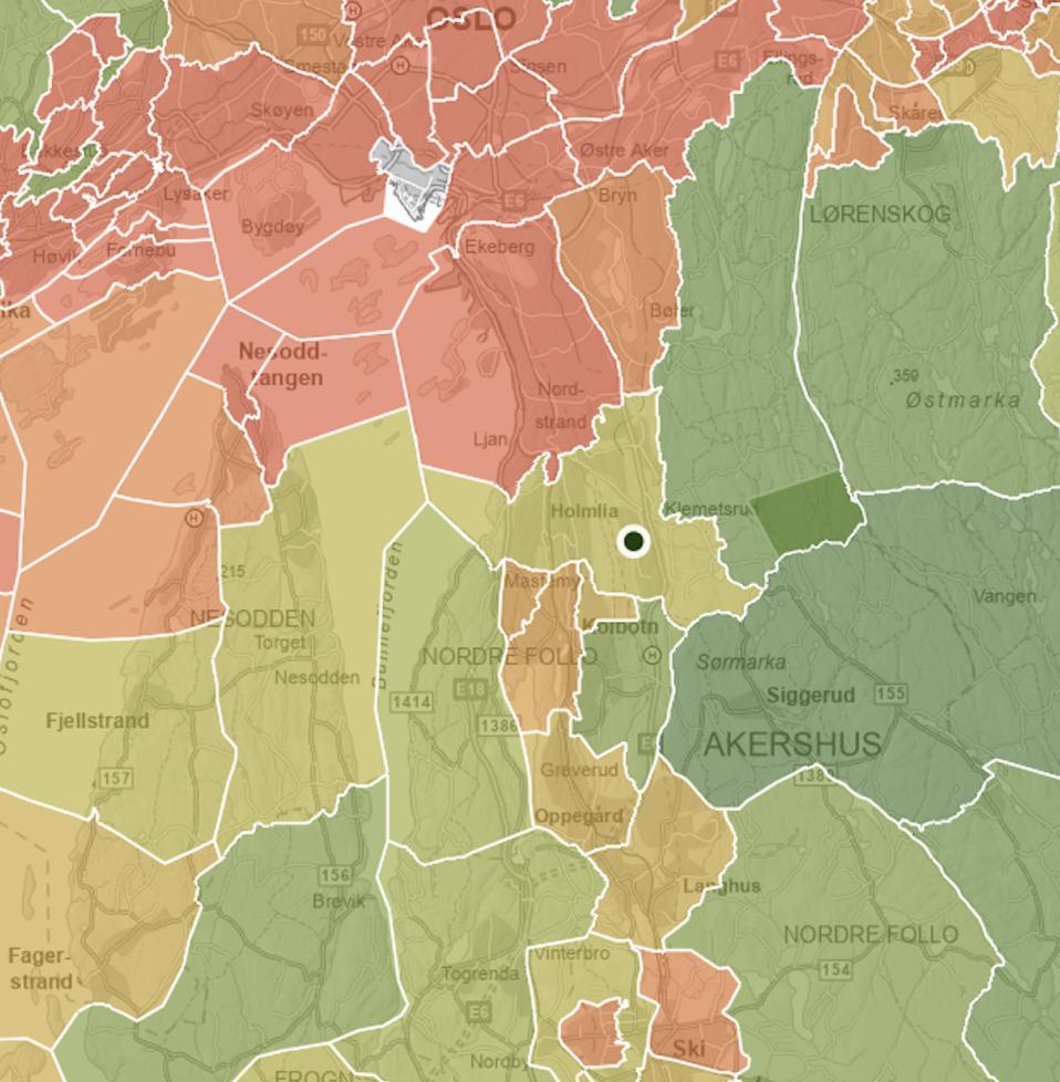
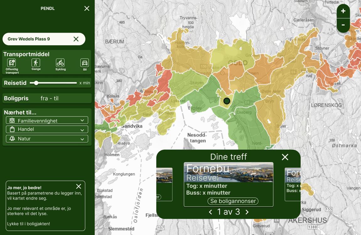
While the first version of the interface showed a gray map with hotspots, the final version ranks every area on the map. Creating a more informative map, which users also found easier to read, was a direct consequence of my insight work.
Close, but to what?
The most useful thing the interviews gave me was how long people were willing to commute. Almost all said thirty to forty minutes, a few up to an hour — and all of them answered in ten-minute intervals. That is why the slider moves in ten-minute steps: it imitates how our users think, and asks less of them than an open input field.
I also identified what mattered when choosing where to live. Closeness to groceries and nature came out on top, but so did schools and kindergartens — even though none of the interviewees had children. They were answering for a life they thought was coming. The list kept growing, and I grouped the filters into categories named for what people were after rather than for the data behind them.
This is also why the map scores areas instead of excluding them. With a list this long, filtering throws away everywhere that narrowly misses one criterion. Scoring keeps those areas visible and lets people decide the trade-offs for themselves.
The map users understood
In our team, I was the only person without prior experience working with maps. That turned out to be useful: I could see what needed explaining, and what the map made obvious on its own.
Our first map was grayscale with heatmaps. Some users liked it; others found it hard to read, and said the heatmaps told them little. So we began experimenting with color to rank the areas instead.
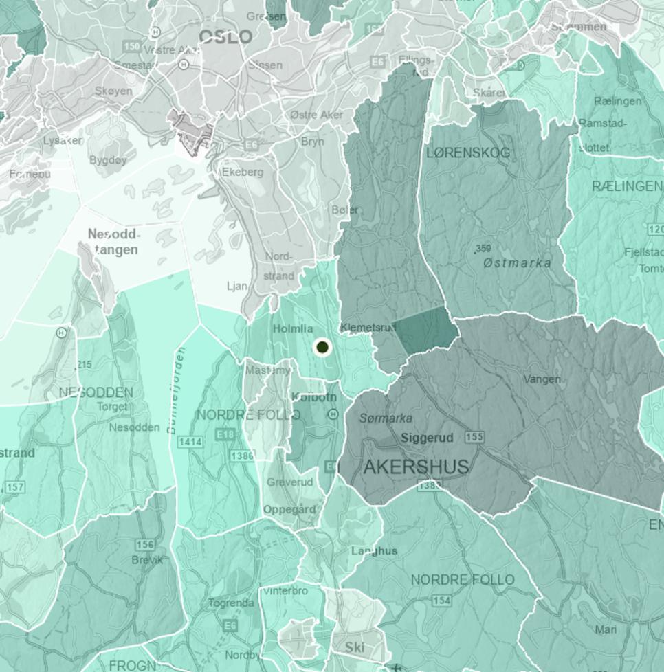
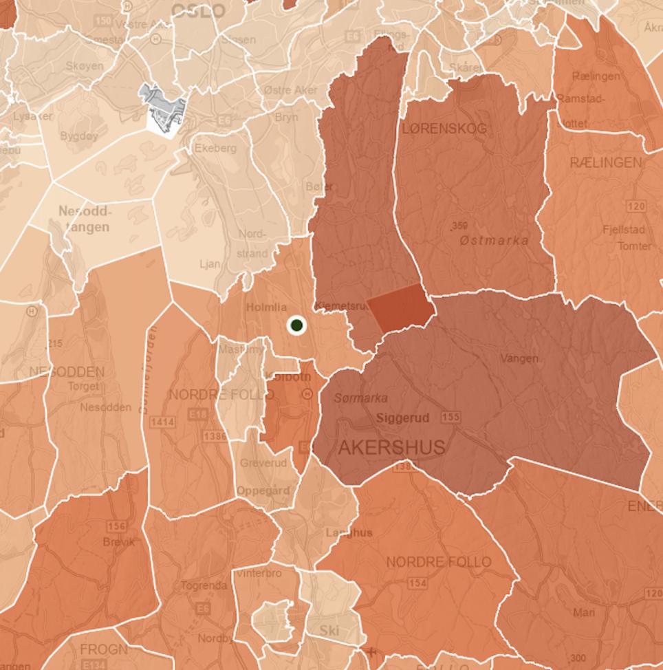
The team produced various colorways — all very pretty. But when I asked users which areas were more or less relevant, neither they nor I could tell. The traffic-light map gave clear feedback: users saw at once which areas PendL was suggesting.
The chosen map has a problem, specifically with red–green color blindness: the best and worst areas can read as the same brown. It was raised at the end of the internship, when we were out of time. Given more, we would have added shape-coding and a legend. This was the first time I was confronted with accessibility issues, long before my thesis and my introduction to universal design.
“Oi, her var det mye grønt”
The first interface prototype was green, and the entire team liked it. But when I showed it to users, they pointed out something I had not seen: the interface felt like it was communicating nature.
So I sketched 22 different colorways and discussed them with my team. We narrowed the 22 down to four, which I brought back to the users. They chose the one with the fewest colors and the lightest backgrounds — so it would not draw attention away from the map. It was navy, which also happens to be Geodata’s color, though that is not why it was picked.
What happened
PendL was prototyped and built by my team and me over the summer. When the project was finished, we presented it to Geodata — both the main office in Oslo, and their Stavanger and Trondheim offices online. After the presentation, nothing further was done with our product.
If PendL had gone further, we would have liked to expand the filter section, and to test whether people actually moved to the areas PendL suggested.
What I would do differently
If I worked on PendL today, the first thing I would fix is the map’s color-blindness problem. The map is, after all, the heart of PendL. Interviewing more people, outside my friend group, would also be a priority. Lastly, I would spend more time with Geodata’s designers. I learned a lot over the summer, but could have learned even more by asking.
PendL was made by five summer interns at Geodata. I was the team’s designer, and the developers built it. The interviews, the user testing, the colorways and the filter grouping were mine; the concept and the direction were the team’s.